
Popular photo editing styles on TikTok in 2026 range from warm, sun-kissed tones and nostalgic film effects to clean, cinematic, moody, and pastel looks. These styles appear across photo carousels, travel dumps, fashion posts, portraits, product showcases, and lifestyle content.
However, a popular style is more than a filter applied at full strength. A convincing edit combines exposure, contrast, color, highlights, shadows, and texture in a way that suits the original photo. This guide explains how eight recognizable TikTok photo editing styles look, when to use them, and how to recreate each one without making the result appear over-edited.
Quick note: TikTok trends change by region, audience, and content category. The styles below are not an official TikTok ranking. Use TikTok Creative Center to check current hashtags, creators, and content patterns in your target market before planning a campaign.
>>> See more:
- E-commerce Photo Editing Services: Top Companies & Solutions For Online Stores
- Photo Editing Price Guide 2026: Rates, Costs & Examples
- 25 Popular Photo Editing Styles In Photography For Stunning Images
What Are Photo Editing Styles On TikTok?
Photo editing styles on TikTok are recognizable combinations of light, color, contrast, texture, and composition that create a particular mood. They help separate a warm travel carousel from a dark fashion portrait or a clean product showcase.
A style is broader than a filter. A filter applies a predefined look, while an editing style can involve several coordinated adjustments, such as:
- Correcting exposure and white balance
- Controlling highlights and shadows
- Adjusting contrast and black levels
- Changing the intensity of individual colors
- Adding grain, fade, sharpening, or texture
- Applying the same visual treatment across a photo carousel
The same settings will not produce identical results on every image. Original lighting, camera quality, skin tone, background color, and exposure all affect the outcome. For that reason, the suggested settings in this article should be treated as starting points rather than fixed formulas.
Quick Comparison Of Popular TikTok Photo Editing Styles
| Editing style | Recognizable look | Best for | Main adjustments |
| Sun-kissed and warm | Golden light and warm skin tones | Travel, beach, outdoor portraits | Warmth, exposure, soft highlights |
| Vintage and film | Muted colors, faded blacks, subtle grain | Fashion, cafés, street photos | Lower contrast, fade, grain |
| Clean and minimalist | Neutral colors and balanced light | Products, interiors, fashion | Exposure correction, clean whites |
| Moody and dark | Deep shadows and restrained colors | Night scenes, fashion, portraits | Blacks, shadows, contrast |
| Bright and airy | Soft highlights and open shadows | Weddings, beauty, lifestyle | Exposure, lifted shadows, low contrast |
| Cinematic | Strong depth and controlled color separation | Travel, urban, storytelling | Contrast, color grading, muted saturation |
| Black-and-white | Strong tonal contrast without color | Portraits, architecture, editorial | Contrast, black levels, texture |
| Soft pastel and dreamy | Delicate colors and gentle contrast | Beauty, flowers, lifestyle | Lifted shadows, soft color, low saturation |
8 Popular Photo Editing Styles On TikTok In 2026
The suggested values below use an approximate -100 to +100 slider scale. Apps label and scale their tools differently, so adjust each value according to the image instead of copying the numbers mechanically.
1. Sun-Kissed And Warm Photo Editing
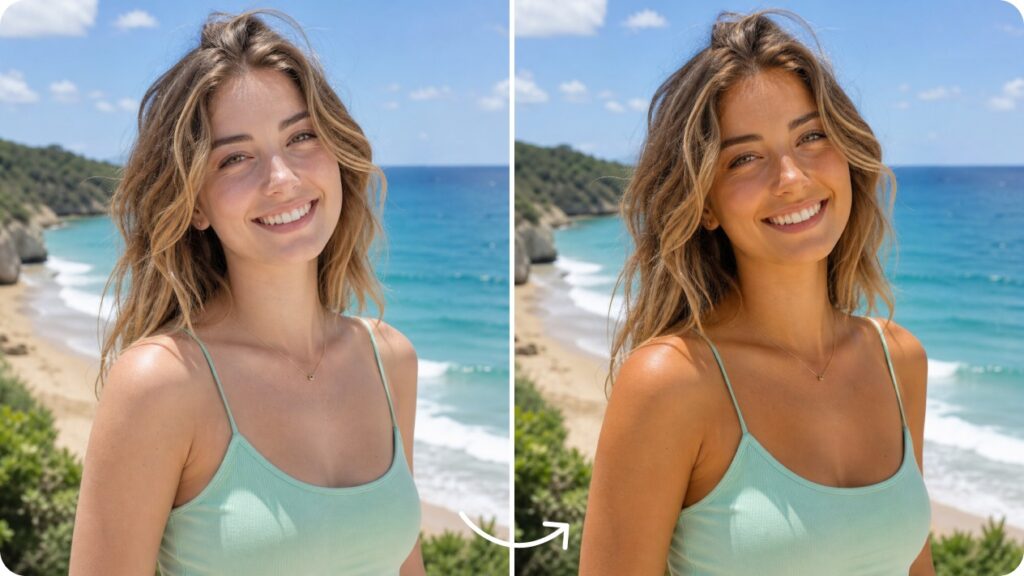
Sun-kissed editing creates the feeling of warm natural light, even when a photo was not taken at perfect golden hour. It is commonly used for travel carousels, beach photos, outdoor portraits, summer outfits, food, and lifestyle content.
How to recognize it:
- Warm whites and golden highlights
- Healthy-looking skin tones
- Moderate saturation
- Soft rather than harsh contrast
- Reduced blue or cool casts
Suggested starting settings:
- Exposure: +5 to +12
- Highlights: -10 to -20
- Shadows: +5 to +15
- Warmth or temperature: +8 to +15
- Saturation: 0 to +8
- Contrast: 0 to +8
Keep the skin close to its natural color. If the face becomes strongly orange, reduce warmth and adjust yellow or orange tones separately. The goal is a believable golden-hour glow, not a heavy orange filter.
Best for: Travel, beach, outdoor portraits, food, summer content, and lifestyle photos.
2. Vintage And Film Photo Editing
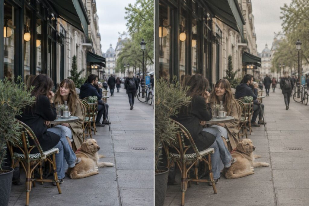
Vintage and film editing recreates visual characteristics associated with analog photography. Instead of making an image look damaged or old, a good film-inspired edit uses controlled softness, muted colors, subtle grain, and slightly faded shadows.
How to recognize it:
- Slightly faded blacks
- Muted or shifted colors
- Softer contrast and sharpness
- Fine, consistent grain
- Warm, green, or faded color casts
Suggested starting settings:
- Contrast: -5 to -15
- Highlights: -10 to -25
- Saturation: -5 to -15
- Warmth: +3 to +10
- Fade or lifted blacks: +5 to +15
- Grain: +10 to +20
Avoid adding maximum grain or reducing clarity until details disappear. Film-inspired editing should still preserve the subject, especially in fashion, food, and portrait images.
Best for: Street photography, cafés, fashion, travel, everyday snapshots, and nostalgic photo dumps.
3. Clean And Minimalist Photo Editing
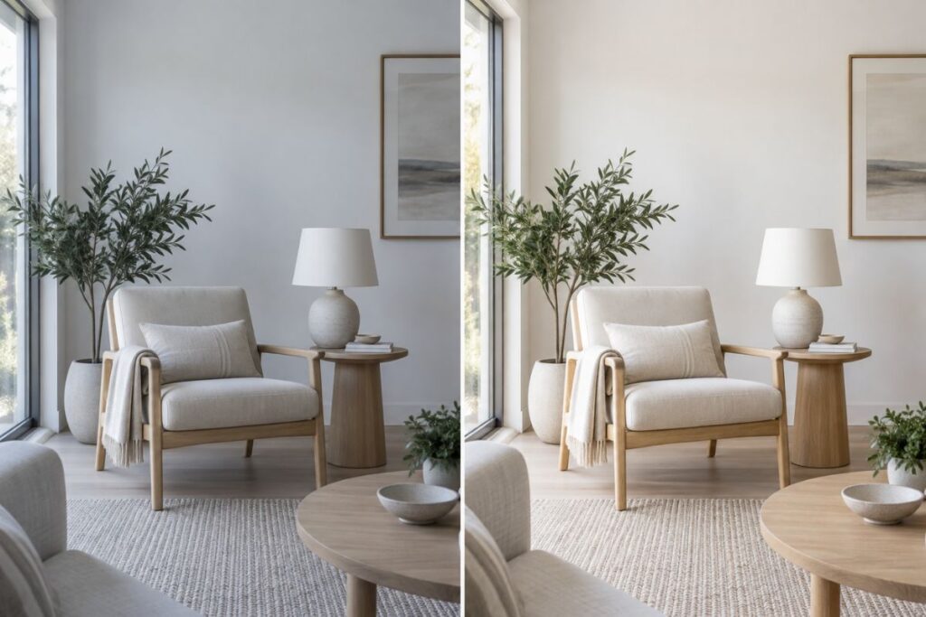
Clean and minimalist editing focuses on accuracy, clarity, and visual simplicity. It works best when the original photo already has good lighting, a controlled background, and a clear subject.
How to recognize it:
- Neutral or slightly warm whites
- Balanced exposure
- Controlled, realistic saturation
- Clean backgrounds
- Natural skin and product colors
Suggested starting settings:
- Exposure: +3 to +10
- Contrast: 0 to +8
- Highlights: -5 to -15
- Shadows: +5 to +12
- Saturation: -5 to +3
- Sharpness: +3 to +8
Do not use excessive whitening, clarity, or sharpening. These adjustments can make skin look harsh, create halos around objects, and reduce the natural depth of the image. For product content, color accuracy is more important than creating an aggressive aesthetic.
Best for: Product images, fashion, architecture, interiors, beauty, and lifestyle content.
>>> See more:
- AI Photo Retouching: 10 Best Tools & How To Use Them In 2026
- Top 10 Photo Editing Services Online In 2026: Comparison & Review
- Birthday Editing Online Free: Tools, Frames & Creative Ideas
4. Moody And Dark Photo Editing
Moody and dark editing uses controlled shadows, deeper blacks, and restrained colors to create atmosphere. It is effective for night scenes, indoor portraits, fashion, architecture, and storytelling content.
How to recognize it:
- Deep shadows with visible detail
- Darker backgrounds
- Strong subject separation
- Muted or cooler colors
- Controlled highlights
Suggested starting settings:
- Exposure: -5 to -15
- Contrast: +10 to +20
- Highlights: -15 to -30
- Shadows: -5 to -15
- Black point: +8 to +18
- Saturation: -5 to -15
Do not create a moody look by lowering exposure alone. That usually produces an underexposed photo. Adjust highlights, shadows, and black levels separately, and keep important facial or product details visible.
Best for: Night photography, dramatic portraits, fashion, cafés, architecture, and urban content.
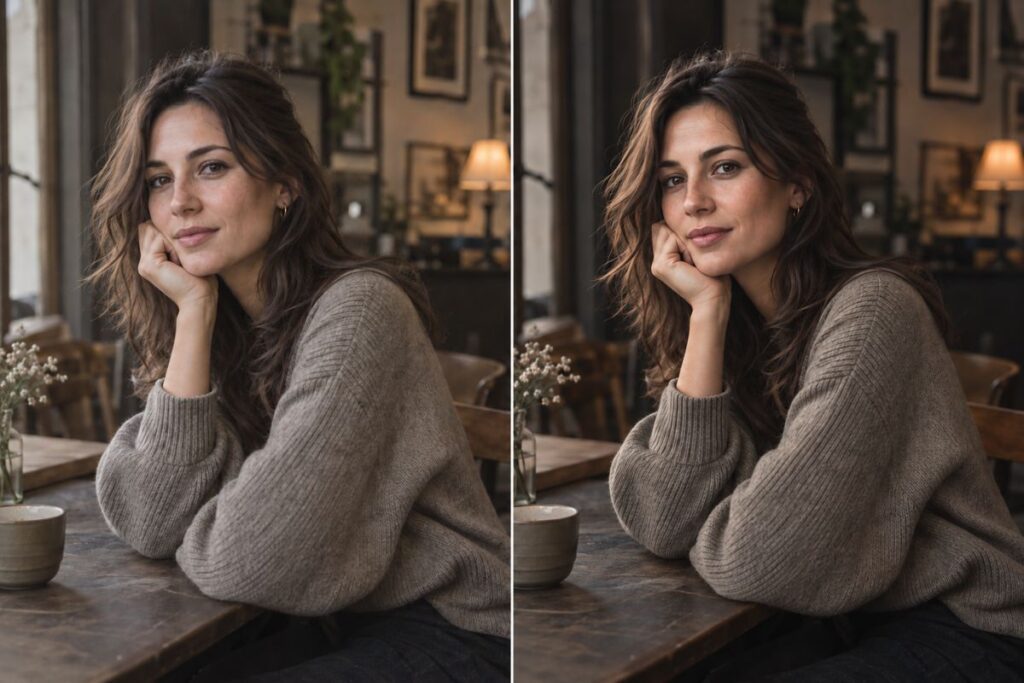
5. Bright And Airy Photo Editing
Bright and airy editing creates an open, soft, and light-filled appearance. Unlike a simple exposure increase, this style protects bright areas while lifting shadows and reducing visual heaviness.
How to recognize it:
- Bright overall exposure
- Soft contrast
- Open, detailed shadows
- Light neutral colors
- Smooth highlights
Suggested starting settings:
- Exposure: +10 to +20
- Contrast: -5 to -15
- Highlights: -10 to -25
- Shadows: +15 to +25
- Black point: -5 to 0
- Saturation: -5 to +3
This style works best with naturally bright images. If the original is severely underexposed, increasing brightness may introduce noise or wash out skin tones. Watch white clothing, windows, and bright backgrounds for lost detail.
Best for: Weddings, beauty, interiors, fashion, portraits, and daytime lifestyle photography.
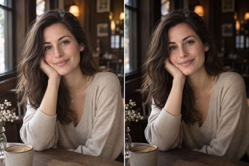
6. Cinematic Photo Editing
Cinematic editing uses contrast, tonal depth, and controlled color separation to make a still image feel like a frame from a film. It often combines cooler shadows with warmer highlights, although the exact palette depends on the scene.
How to recognize it:
- Defined light and shadow
- Muted overall saturation
- Deliberate color contrast
- Strong visual depth
- A clear storytelling subject
Suggested starting settings:
- Exposure: -5 to +3
- Contrast: +10 to +20
- Highlights: -15 to -30
- Shadows: -5 to -15
- Saturation: -5 to -12
- Color grading: slightly cool shadows and slightly warm highlights
Avoid forcing teal-and-orange colors into every image. A cinematic edit should respond to the existing lighting and story. If every color becomes intense, the photo will look like a preset rather than intentional color grading.
Best for: Travel, urban photography, fashion editorials, portraits, and narrative carousels.
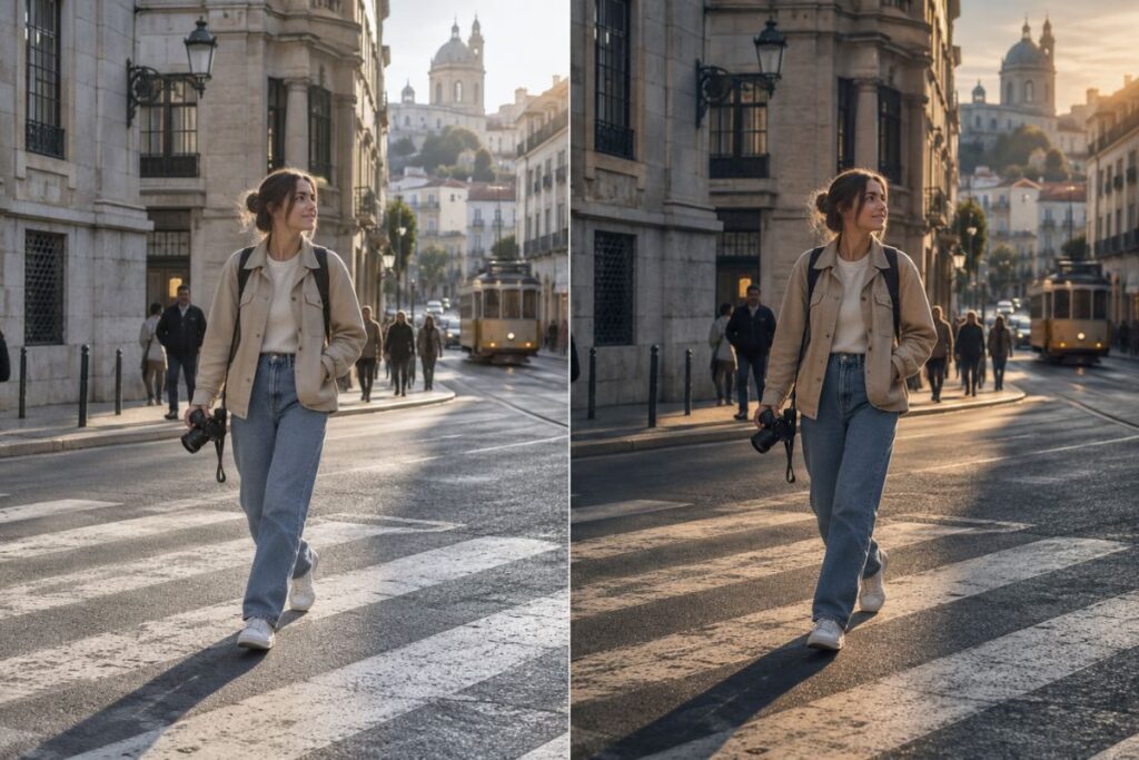
7. Black-and-White And Monochrome Editing
Black-and-white editing removes color so that light, shadow, texture, expression, and composition become more prominent. Monochrome edits can appear timeless, editorial, dramatic, or intimate depending on the contrast.
How to recognize it:
- Clear tonal separation
- Intentional black and white points
- Visible texture
- Strong shapes or expressions
- Little dependence on color for meaning
Suggested starting settings:
- Convert to black-and-white before fine-tuning
- Contrast: +8 to +20
- Highlights: -10 to -25
- Shadows: -5 to +10, depending on the subject
- Black point: +5 to +15
- Texture or clarity: +3 to +10
After removing color, adjust the brightness of the original color channels if the editor allows it. This helps separate skin, sky, clothing, and background elements that may otherwise become similar shades of gray.
Best for: Portraits, street photography, architecture, editorial content, and emotional storytelling.
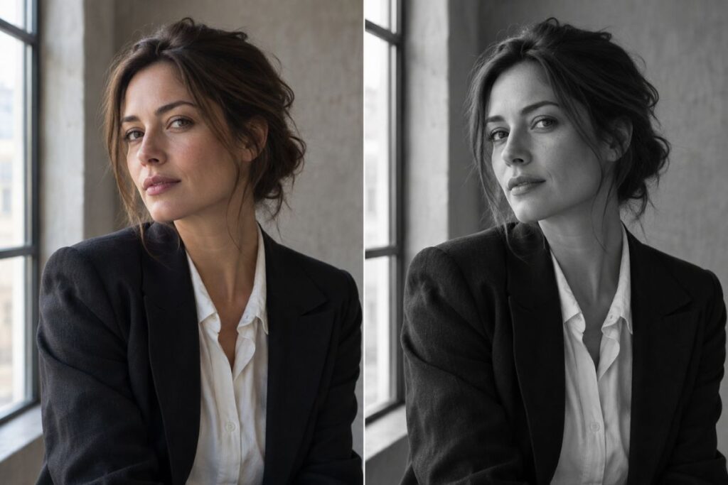
8. Soft Pastel And Dreamy Photo Editing
Soft pastel and dreamy editing uses delicate colors, gentle contrast, and lifted shadows to create a light, romantic, or imaginative mood. It performs best when the original image has soft lighting and a relatively simple color palette.
How to recognize it:
- Pale pink, blue, yellow, lavender, or mint tones
- Low to moderate saturation
- Lifted shadows
- Soft highlights and contrast
- A light, hazy atmosphere
Suggested starting settings:
- Exposure: +5 to +15
- Contrast: -10 to -20
- Highlights: -5 to -15
- Shadows: +10 to +20
- Saturation: -5 to -15
- Color luminance: increase selected pastel colors slightly
Pastel does not mean gray. Instead of reducing global saturation too far, lower the intensity of dominant colors and increase their luminance selectively. Strong midday shadows or highly saturated backgrounds may need local corrections before the pastel look appears natural.
Best for: Beauty, flowers, fashion, cafés, portraits, travel, and soft lifestyle content.
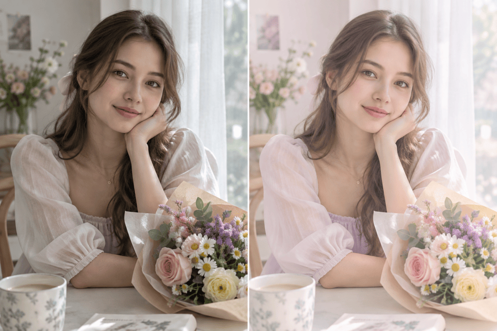
Alt text: Soft pastel TikTok photo editing with delicate colors and gentle contrast
Caption: Pastel editing softens color and contrast while keeping the image bright and intentional. (Source: AI-generated illustration by DIGI-TEXX)
>>> See morre:
- Top 7 Ecommerce Product Photo Retouching Services Compare
- Fashion Photo Editing Services: Benefits, Techniques & Expert Tips
- Best Product Photo Editing Services For eCommerce: Top Providers Compared
How To Choose The Right TikTok Photo Editing Style?
Choose the style based on the photo, subject, lighting, and intended mood, rather than choosing a trend first.
| Photo type | Suitable editing style |
| Beach or travel photos | Sun-kissed and warm |
| Street or nostalgic photos | Vintage and film |
| Product or fashion photos | Clean and minimalist |
| Night or dramatic portraits | Moody and dark |
| Wedding or lifestyle photos | Bright and airy |
| Travel or storytelling images | Cinematic |
| Editorial or emotional portraits | Black-and-white |
| Beauty or soft lifestyle photos | Pastel and dreamy |
The original lighting should be the first consideration. A dark indoor photo will rarely become naturally bright and airy by simply increasing exposure. Likewise, a brightly lit beach image may need significant tonal adjustment before a dark, cinematic style works.
Consider the subject, too. Strong color grading can distract from fashion, beauty, or product details that need to remain accurate.
TikTok itself recommends using trend data rather than relying only on assumptions. Its Creative Center lets users filter trends by industry and time frame and examine trendlines, related videos, audience insights, and regional popularity. This is especially useful when a creator wants to distinguish a short-lived editing hack from a broader visual trend.
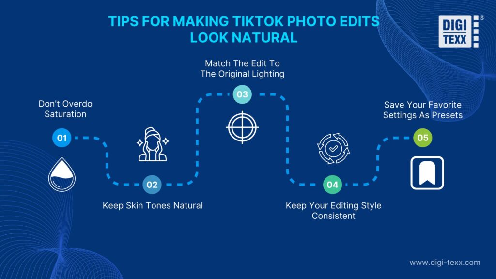
Tips For Making TikTok Photo Edits Look Natural
To keep TikTok photo edits natural and polished, pay attention to a few key aspects, from color intensity and skin tones to lighting, consistency, and editing settings.
Don’t Overdo Saturation
High saturation can make a photo appear artificial, particularly when several colors are already strong in the original image.
Increase saturation gradually and consider adjusting individual colors instead of increasing global saturation. This gives you more control over skin, clothing, greenery, and background tones.
Keep Skin Tones Natural
Skin tones are one of the easiest ways to tell whether an edit has gone too far.
Avoid excessive orange, red, yellow, or magenta adjustments on portraits. When applying a warm, vintage, or cinematic style, check the subject’s skin separately from the rest of the image.
Adobe Lightroom also provides portrait-oriented preset options, including Deep Skin, Medium Skin, Light Skin, and Black & White, showing how skin treatment can be separated from broader visual styles.
Match The Edit To The Original Lighting
Editing should work with the original light rather than fight against it.
For example, warm editing works naturally with golden-hour sunlight, while a dramatic moody treatment can complement directional or low-key lighting. Trying to turn a flat, poorly exposed image into a high-contrast cinematic photo often produces unnatural shadows and highlights.
Correct exposure and white balance before applying the final style.
Keep Your Editing Style Consistent
If several photos appear together in a TikTok carousel, inconsistent color grading can make the post feel disconnected.
Use similar exposure, white balance, contrast, and color treatment across the images. The edits do not need to be identical, but they should share the same overall visual direction. Consistency is particularly important for creators and brands building a recognizable visual identity.
Save Your Favorite Settings As Presets
Presets make repeated editing faster and help maintain consistency across multiple images.
Lightroom allows users to create and save their own presets, while its preset Amount slider allows the intensity to be adjusted rather than applying every setting at full strength. A useful workflow is to create one base preset for each recurring style, then fine-tune exposure and white balance for each individual photo.
Popular Photo Editing Styles & TikTok Photo Editing Hacks
A photo editing style is the overall visual direction of an image. A TikTok editing hack is a shortcut, setting combination, or sequence used to create a particular effect.
| Editing style | Possible editing hack |
| Vintage and film | Lower contrast, lift blacks, mute colors, and add grain |
| Moody and dark | Lower exposure slightly, deepen blacks, and control highlights |
| Bright and airy | Increase exposure, open shadows, and soften contrast |
| Cinematic | Add tonal contrast and separate warm highlights from cool shadows |
The difference matters because a hack may work well on the creator’s original photo but produce a poor result on another image.
TikTok’s 2026 trend forecast also emphasizes discovery, useful tips, hacks, and authentic content rather than passive consumption. TikTok reports that 2 in 3 searchers on the platform say a central reason for using TikTok as a search platform is discovering useful things beyond their original search.
For this reason, creators can use editing hacks as starting points, but understanding the underlying style provides more control and produces more consistent results.
FAQs About Popular Photo Editing Styles On TikTok
What Type Of Edits Are Trending On TikTok?
Warm, vintage, cinematic, moody, clean, bright, monochrome, and soft pastel edits are among the common visual directions used for TikTok photo content in 2026. However, trends can vary by region, audience, and content category.
TikTok Creative Center provides trend data by industry and time frame, including trendlines, audience insights, and regional popularity, making it a better source for checking current trends than relying on a single viral post.
What Are Some Trending Photo Editing Styles?
Popular TikTok photo editing styles include sun-kissed and warm, vintage and film, clean and minimalist, moody and dark, bright and airy, cinematic, black-and-white, and soft pastel.
The best option depends on the subject and original lighting. A trend should guide the creative direction, not replace basic exposure and color correction.
What Is the Best Photo Editor For TikTok?
The best photo editor for TikTok depends on how much control you need. Built-in phone editors are suitable for quick adjustments, while apps such as Lightroom provide more advanced color, preset, and tonal controls.
For creators handling large numbers of images, a desktop workflow can be more efficient because presets and repeatable adjustments help maintain consistency across an entire batch.
DIGI-TEXX Contact Information:
🌐 Website: https://digi-texx.com/
📞 Hotline: +84 28 3715 5325
✉️ Email: [email protected]
🏢 Address:
- Headquarters: Anna Building, QTSC, Trung My Tay Ward
- Office 1: German House, 33 Le Duan, Saigon Ward
- Office 2: DIGI-TEXX Building, 477-479 An Duong Vuong, Binh Phu Ward
- Office 3: Innovation Solution Center, ISC Hau Giang, 198 19 Thang 8 street, Vi Tan Ward
Reference:
- Adobe. (2026). Presets in Lightroom. Adobe Help Center. https://helpx.adobe.com/lightroom/desktop/edit-photos/presets.html
- Freeman, W. T. (2026). Color technology. MIT Computer Science and Artificial Intelligence Laboratory. https://people.csail.mit.edu/fredo/comp-photo-book/02-fundamentals-09-color-technology.html